Transformed Everysport’s platform, overcoming technical hurdles and boosted user growth
With limited user data and technical hurdles, I led a full redesign of Everysport’s platform. The result? A transformed user experience that drove significant growth in traffic and subscriptions. This case study explores the key design decisions behind the success.
Background
Everysport is a platform that offers comprehensive coverage of various sports, providing users with up-to-date scores, news, and information. It serves as a hub for sports enthusiasts, offering insights into teams, players, and events, with a focus on engagement through user-friendly features and seamless navigation.
The platform caters to a wide range of sports and is designed to keep users informed and connected with the latest in the sporting in Sweden.
Problem Overview
Everysport’s platform struggled with low user engagement and a complex interface. Initially, I couldn’t conduct user interviews due to a small user base, which made it difficult to gather direct feedback.
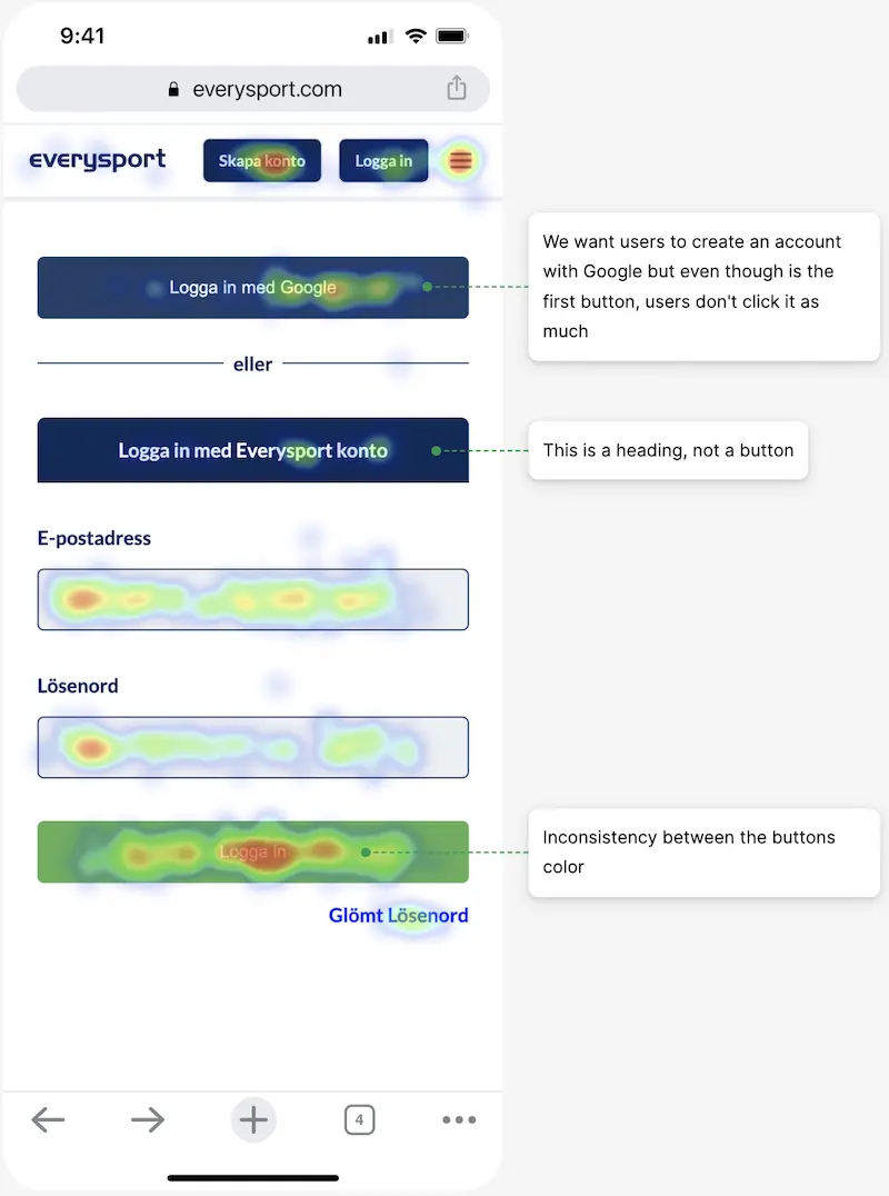
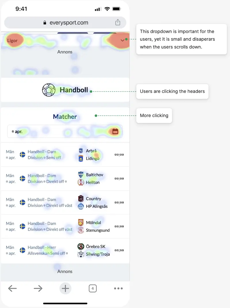
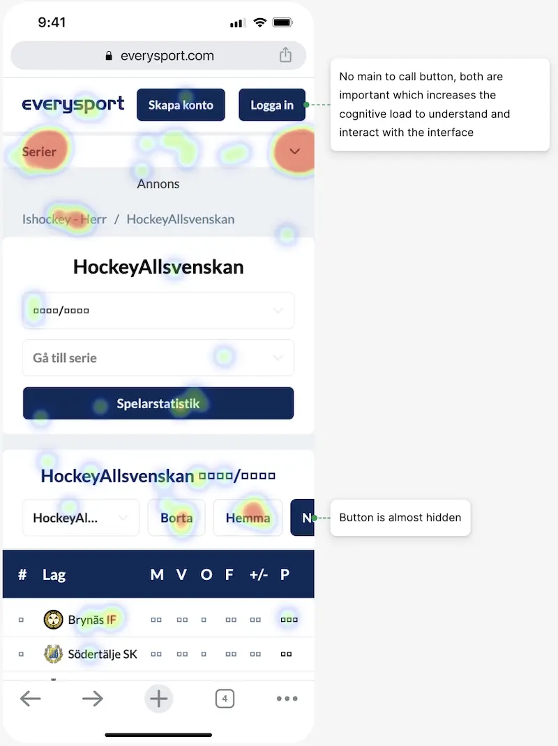
Heat maps from pages with common flaws.
Log in Page
Sport Page
Result Page
I conducted 5 interviews to cover most of the issues.
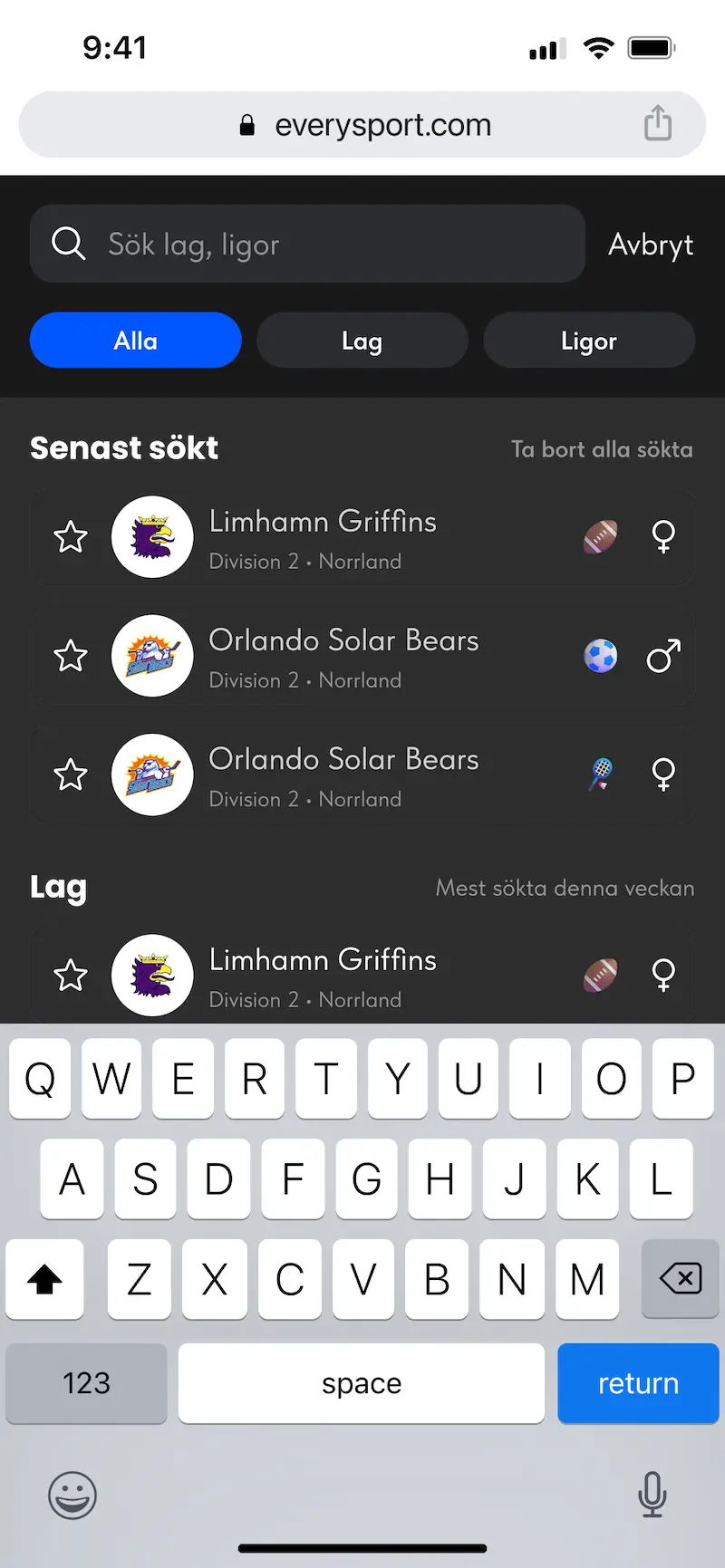
Difficult to find any team, I have to know exactly in what division and rank to look into.
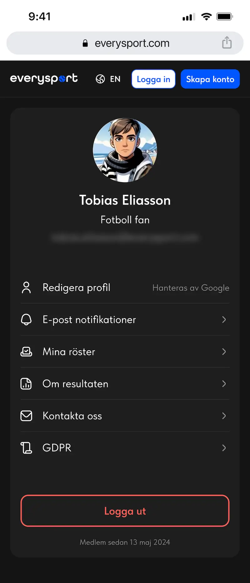
I don’t understand what’s the benefit of creating an account.
The website feels a bit slow.
Som text on the website is too small to see, specially those numbers in the tables. a bit slow.
After that I split the problems into 6 different improvements the website needs.
Improve visual hierarchy
Better UX
Button color consistency
Search feature
Easier navigation
New features
Approach
The design process was iterative and messy, complicated further by technical limitations. Small design changes weren’t possible without affecting the entire system due to how the code was built. This forced me to redesign almost everything and release the entire update at once, leaving limited time for flow testing.
Challenges and Adaptations
Without early-stage user interviews, I relied on alternative research methods and hypothesis testing. Technical constraints meant I had to take larger design risks, and continuous back-and-forth adjustments were necessary to mitigate the impact on functionality. By focusing on overall usability and addressing these limitations, I aimed to create a cohesive user experience.
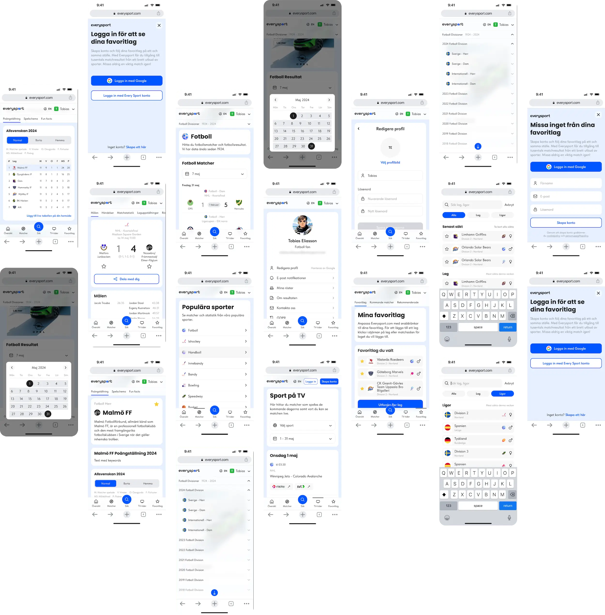
Navigation
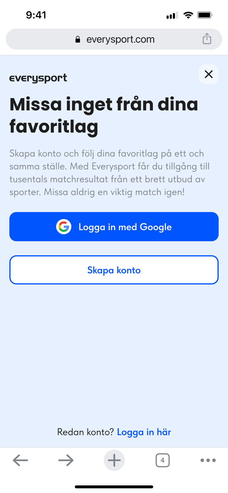
Too many things to look at and it does not tell the value of the registration.
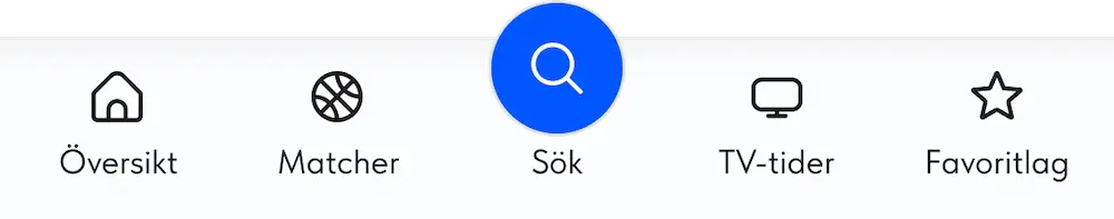
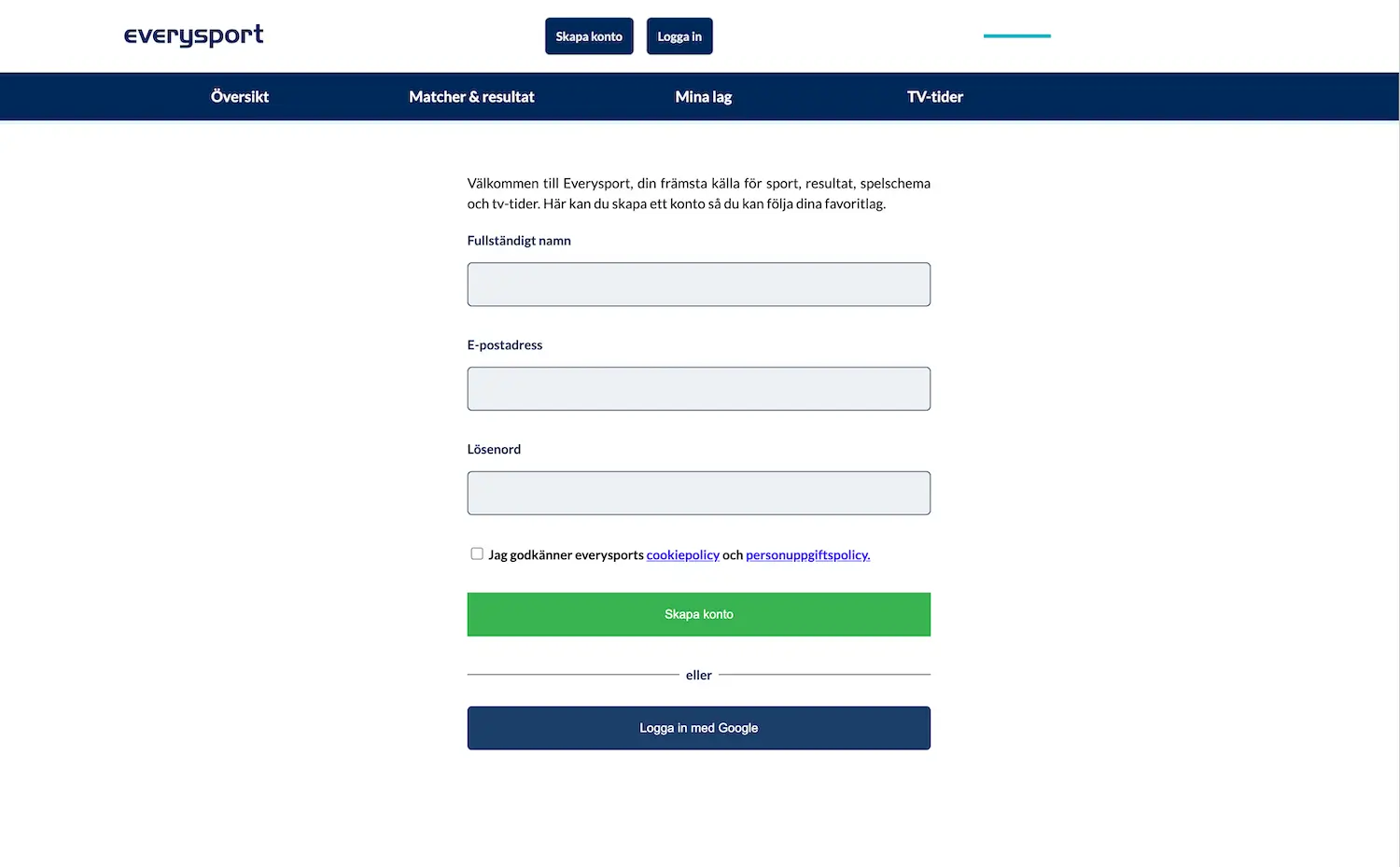
Easy to navigate menu with the menu at the top as well as in the bottom to resemble an app. Makes the different pages stand out more, which increased the views on the other pages.
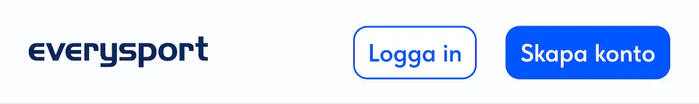
Register and Log in buttons are the same color which makes the user take longer to take action and does not shows the primary intention.
There is no need to have two rows for the navigation. Keeping one makes the viewport of the page content higher.
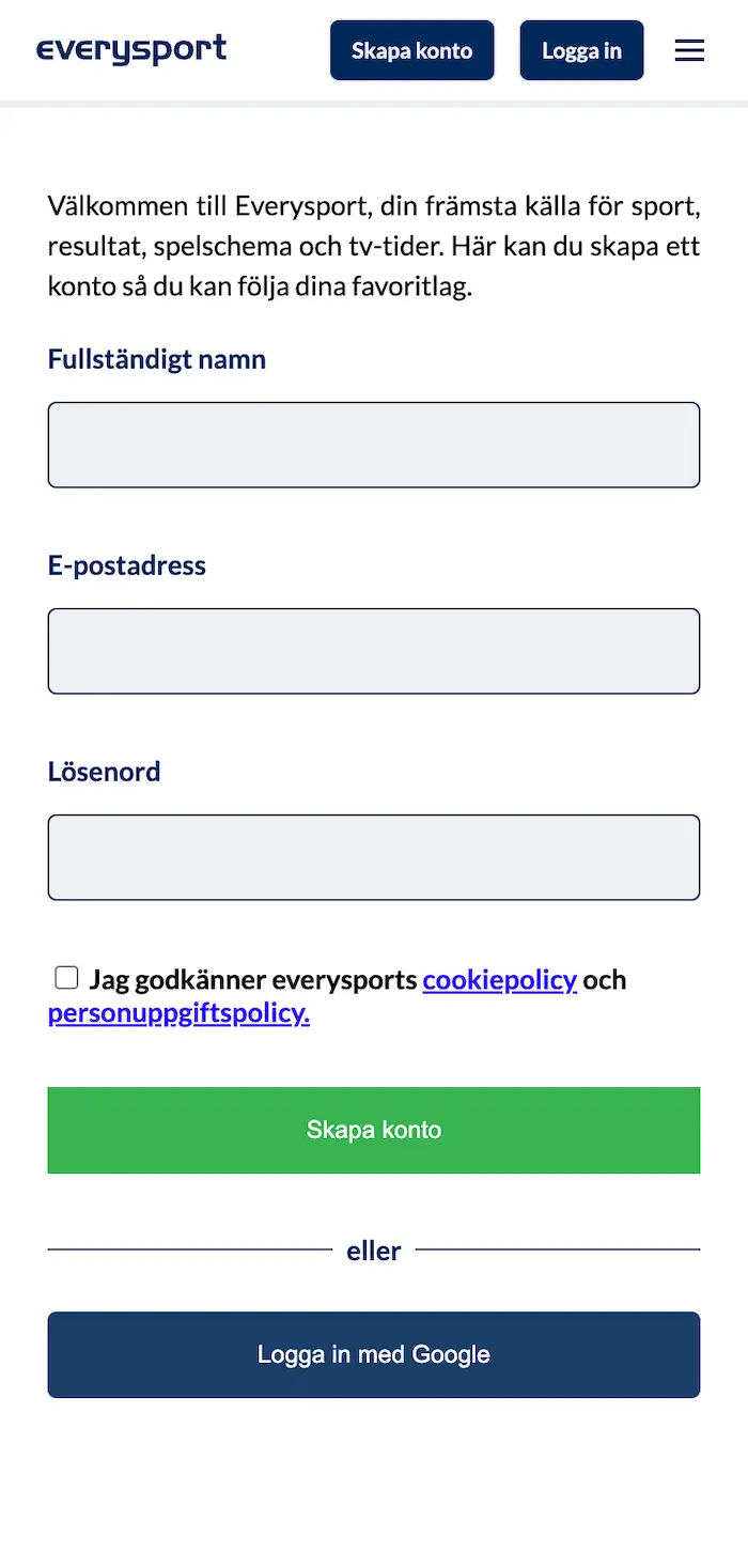
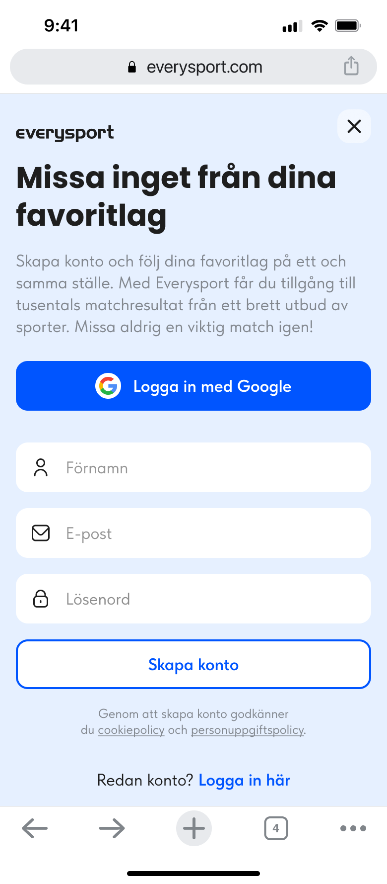
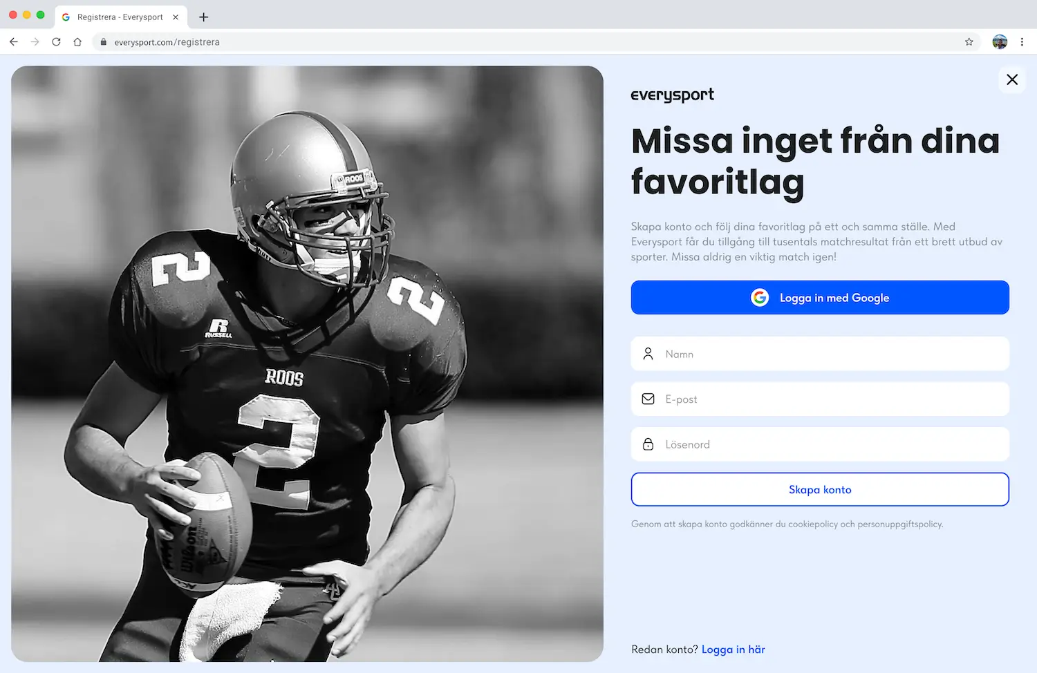
Register Page
Too many things to look at and it does not tell the value of the registration.
Clear hierarchy with the login with google as the fist choice to make the registration smoother.
If users wants to create an account with the normal way its also possible.
Too many things to look at and it does not tell the value of the registration. Different button color.
Uncluttered black and white images with a person that is looking to the right to guide the users to the form. Clear hierarchy with clear headline that tells the value of the registration.
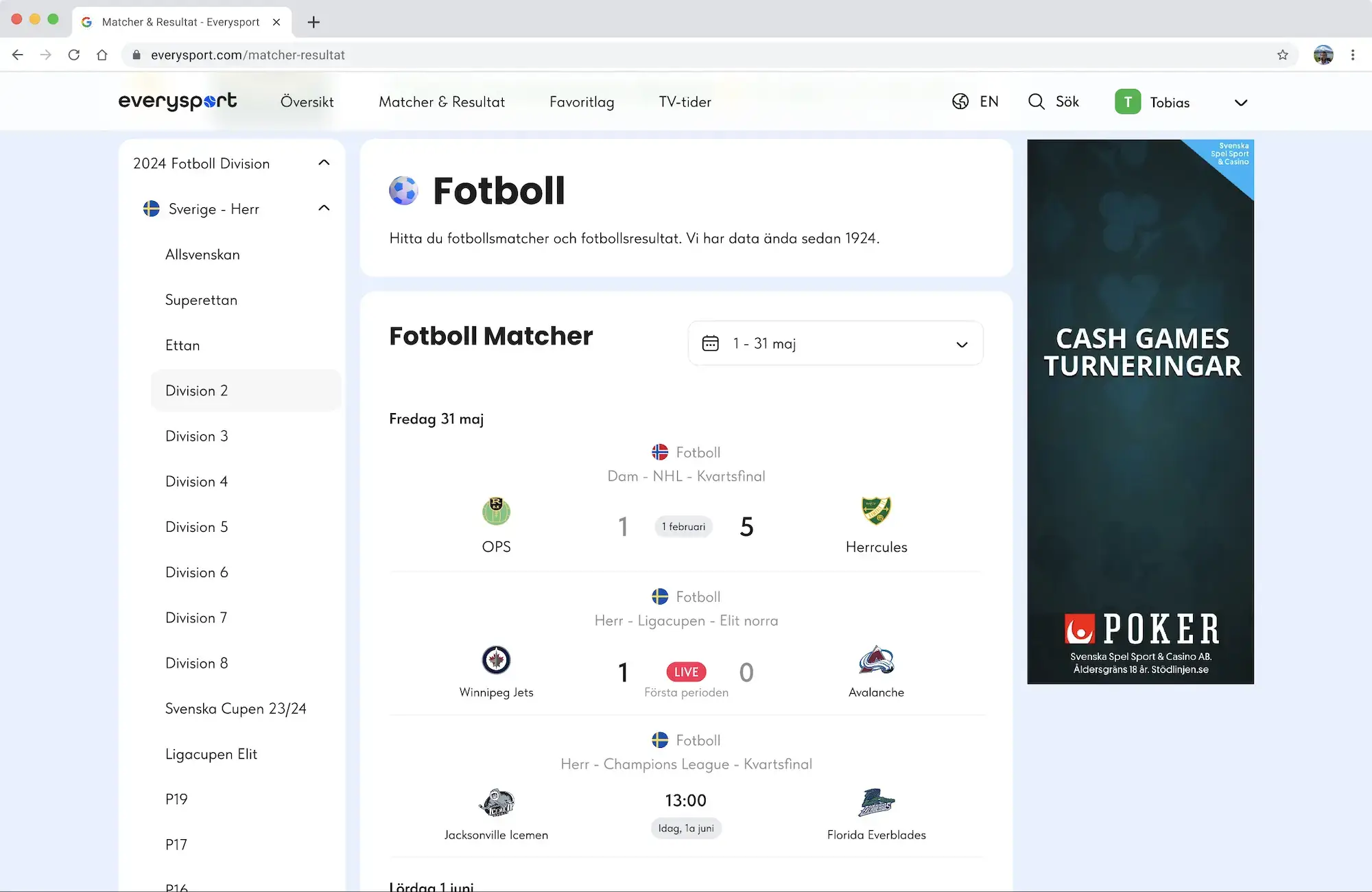
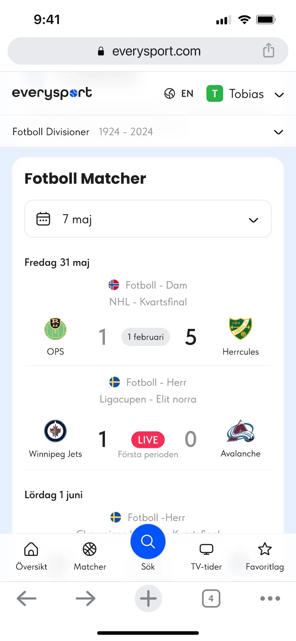
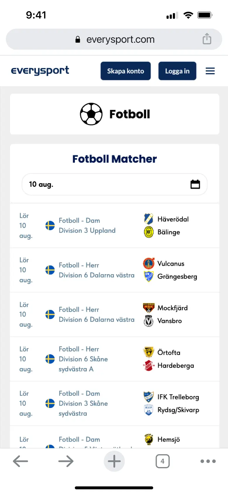
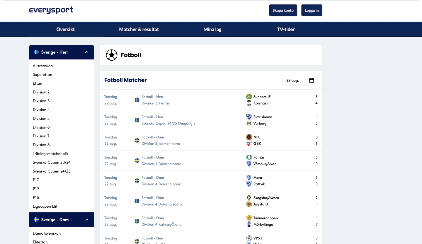
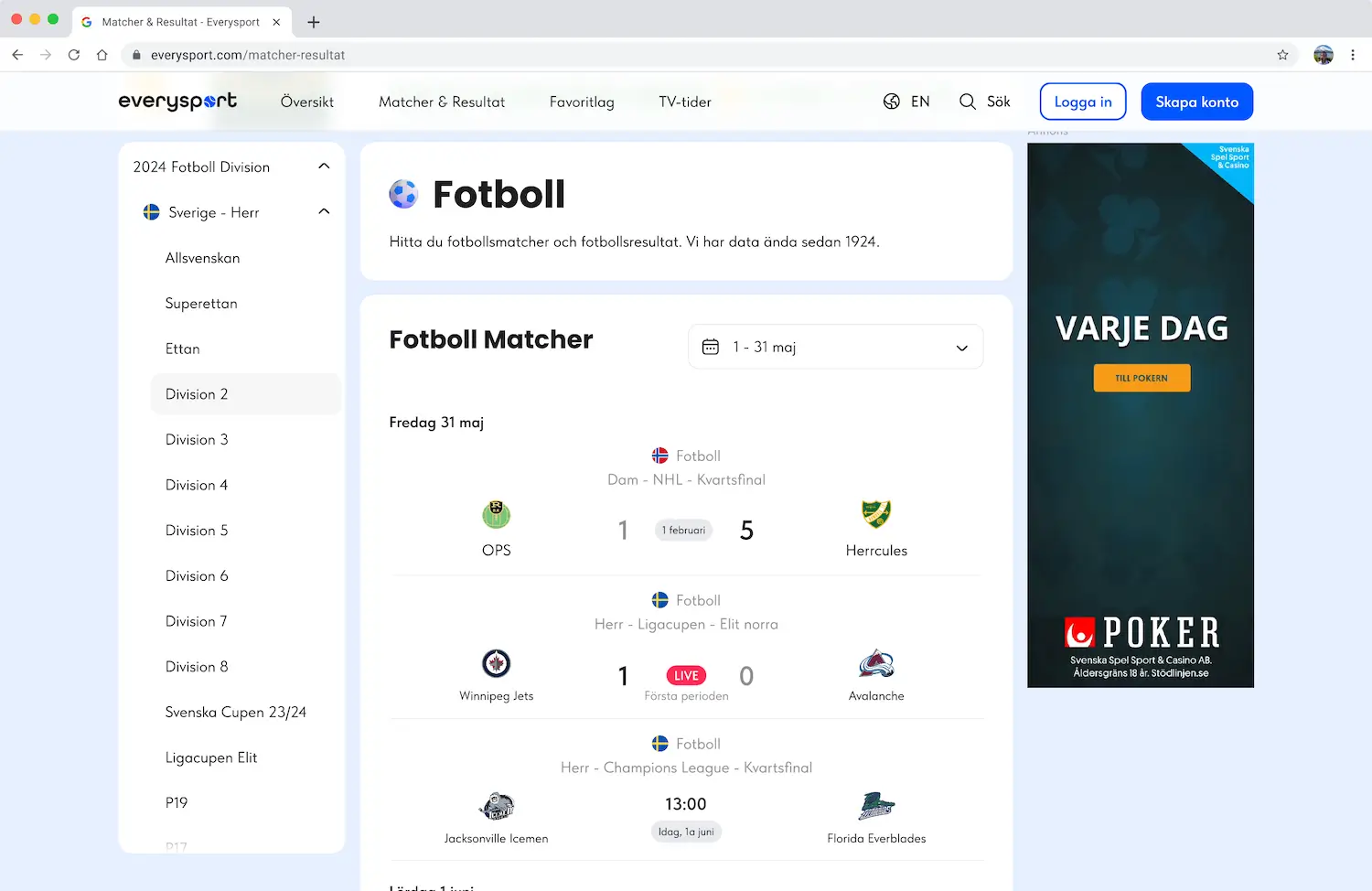
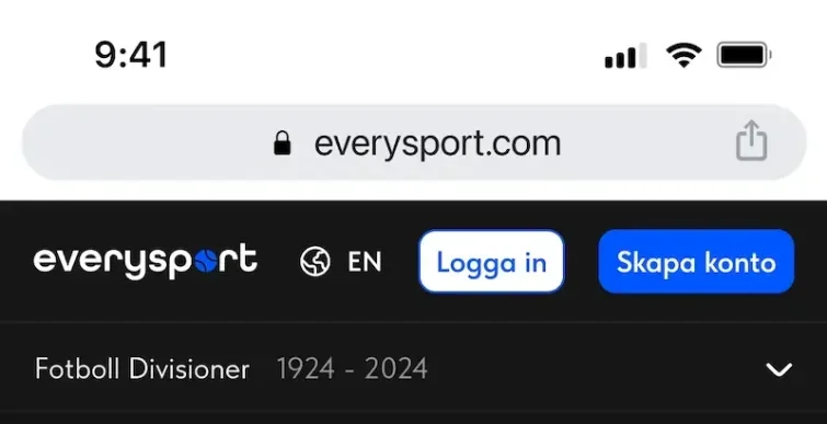
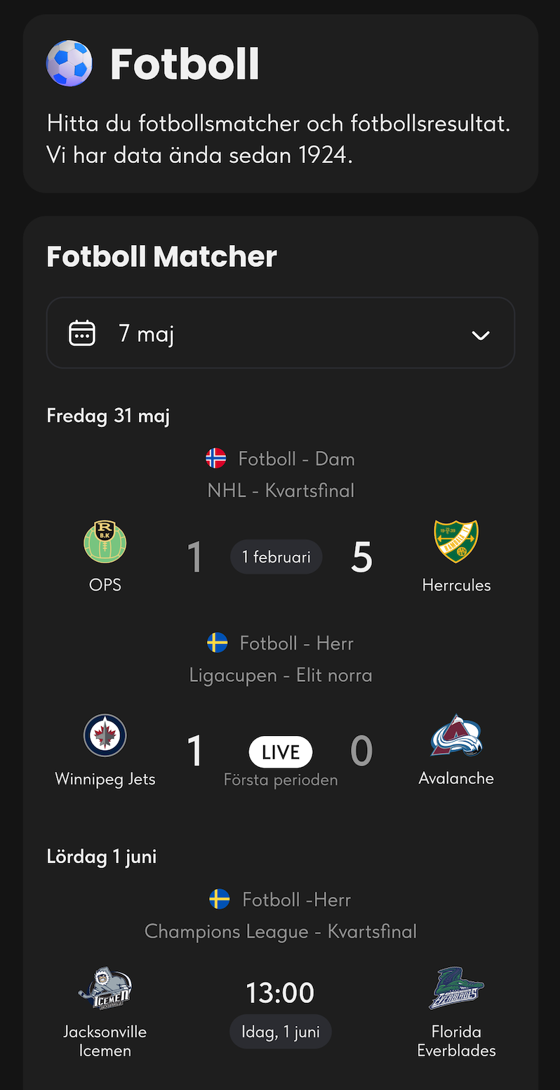
Sport Page
Text too small
Users recognise their team by the logo and its also too small.
One thing that makes us stand out from the rest sport statistics is that we have stats from over 100 years old. Now there is no easy way to find those stats.
With the new design we also show the users that we have statistics from 1924 in the menu.
3D icons for the sports make the website more modern.
The text and the team logos are bigger now for easy recognition. I also added in what serie the match is playing.
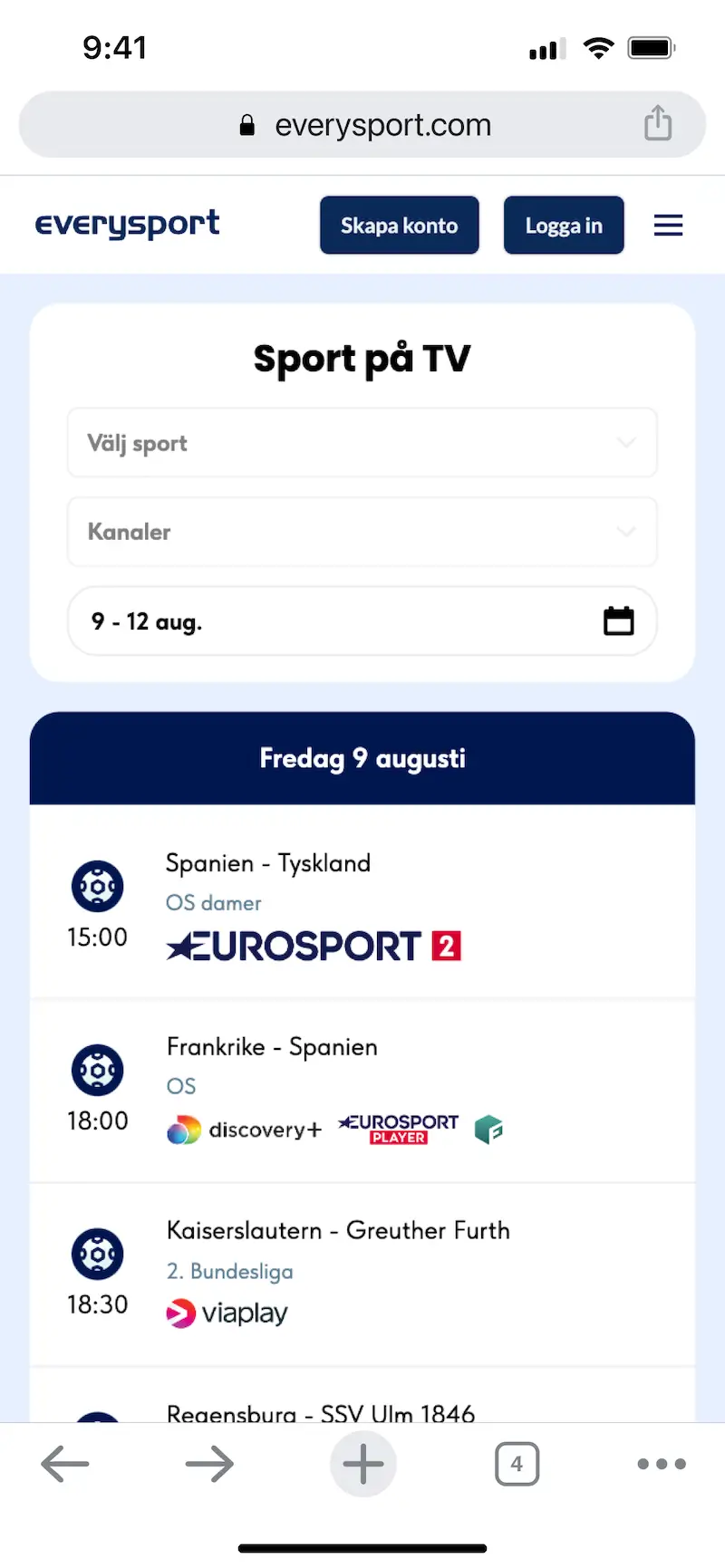
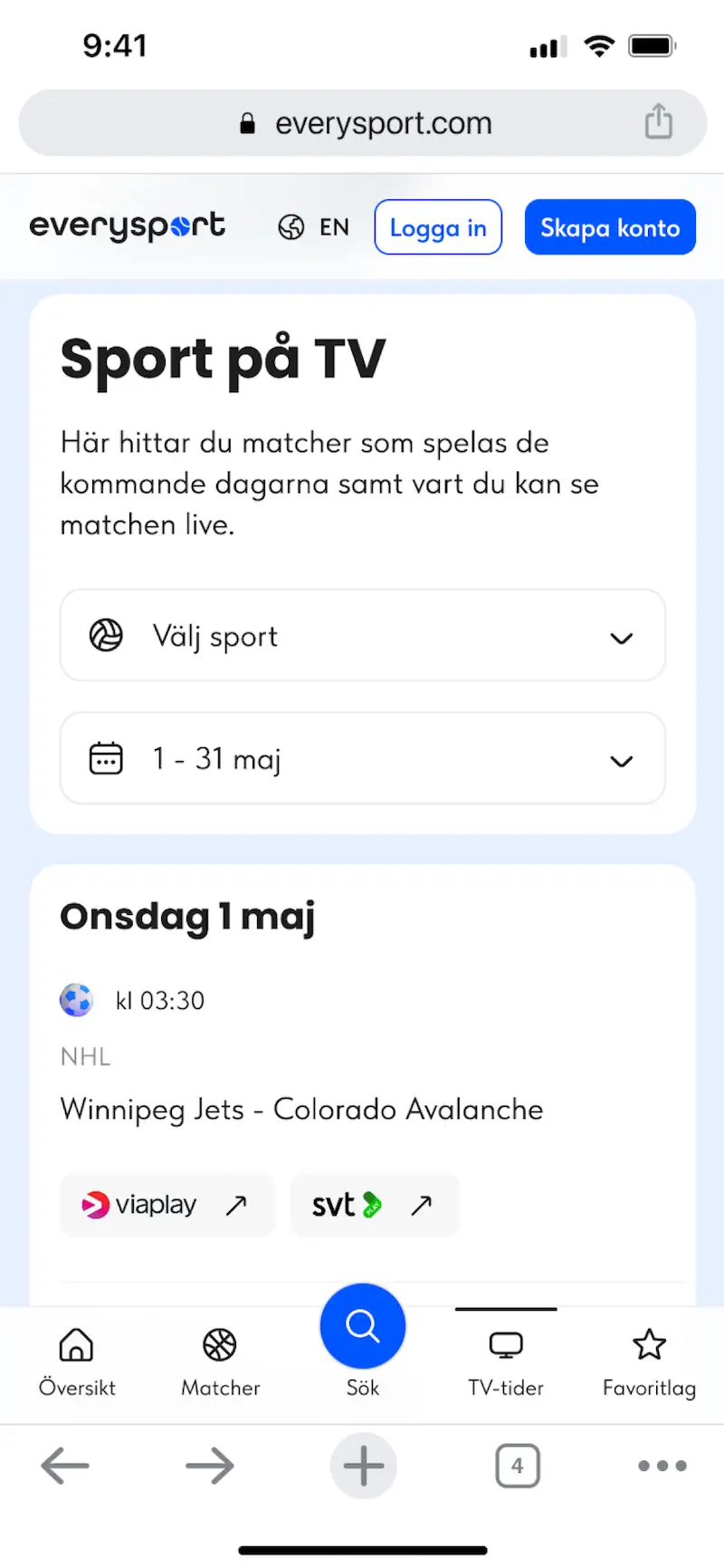
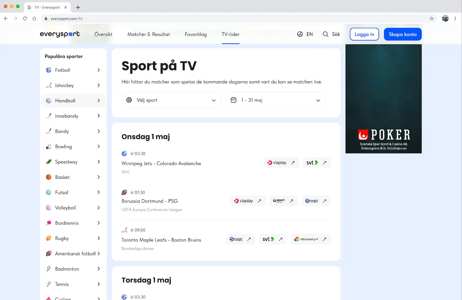
TV Page
Not so many users are filtering by channel.
The date heading looks like a button.
Not many users know they can click on the channel logos to go to and watch the game.
Page explanation and easier filter.
Now is understandable that when clicking on the news channel logo it will open a new page.
Other design details
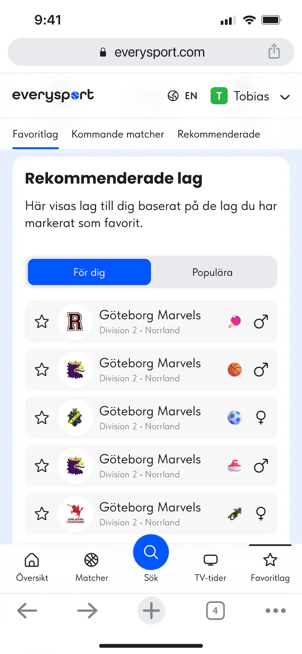
Mark a team as favorite
3D icons
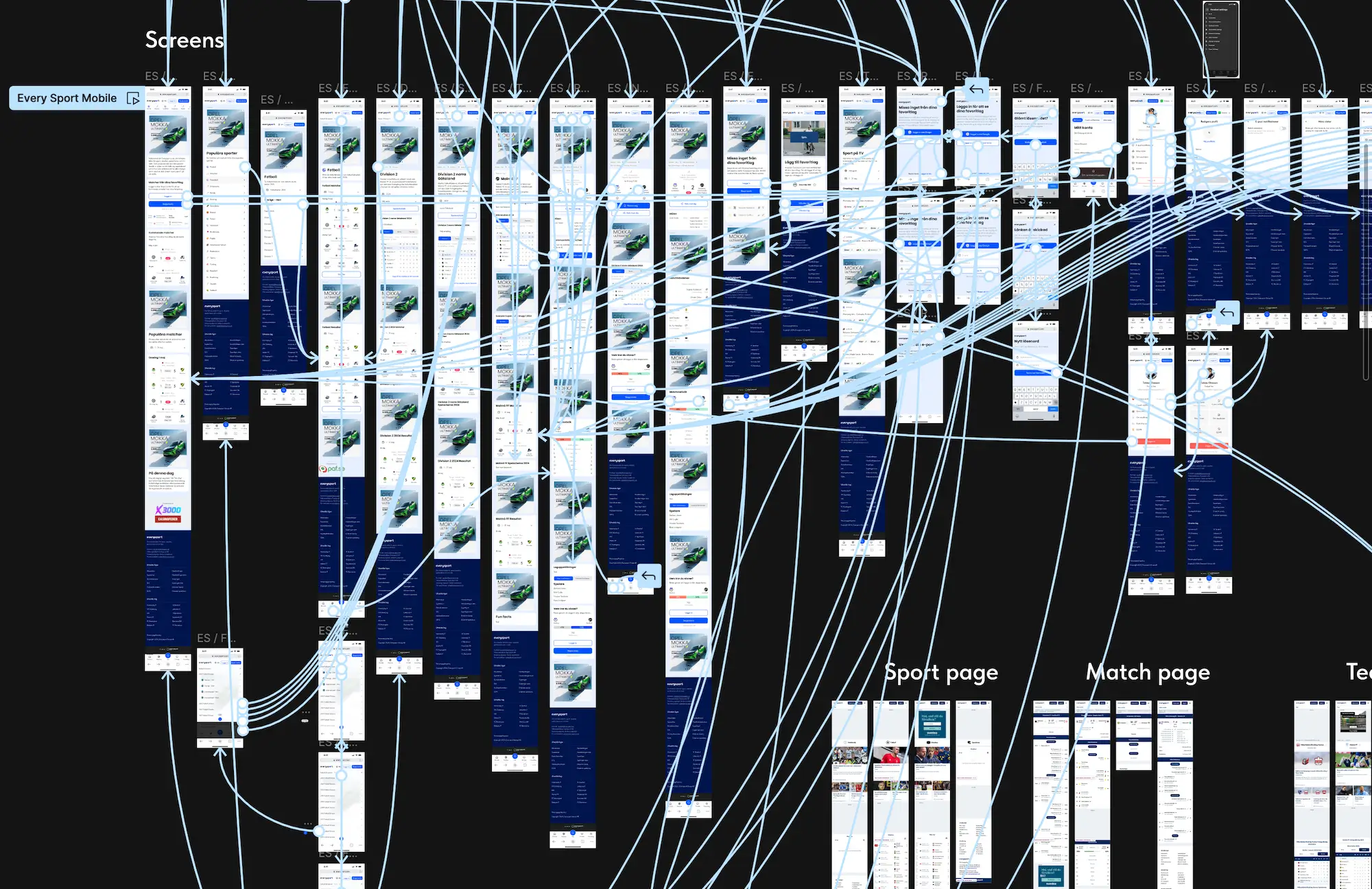
Prototype
A fully functional prototype was developed for both mobile and desktop versions and tested with users.
Dark mode
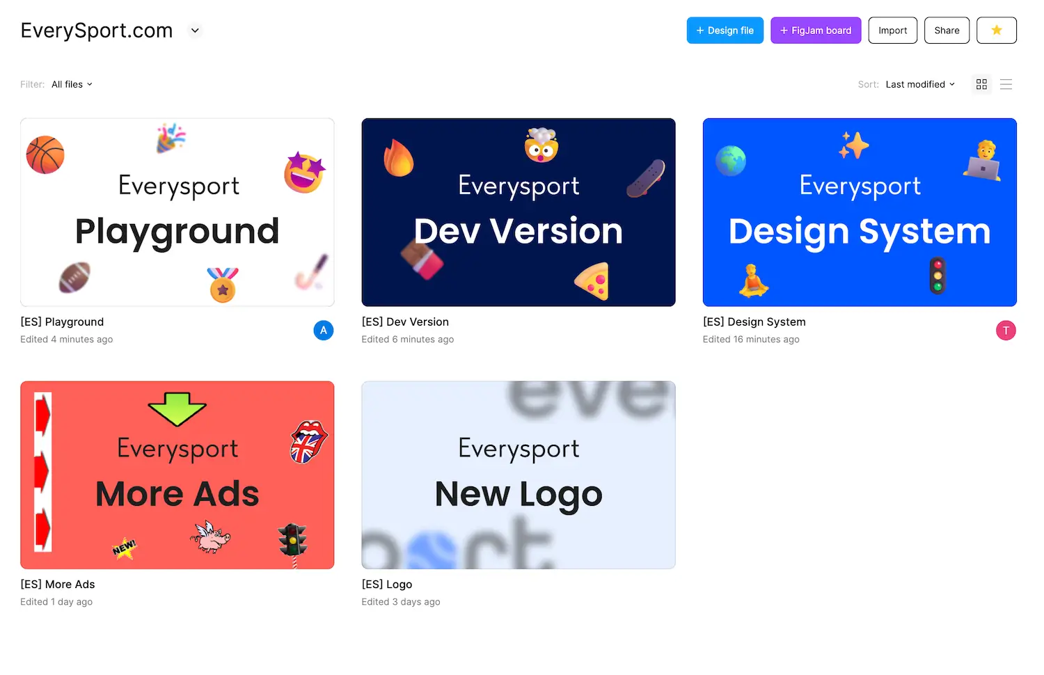
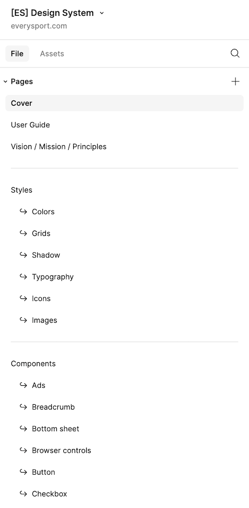
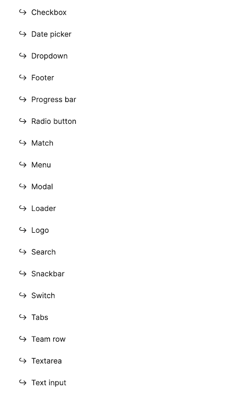
Figma files
I organized separate Figma files to make it easier for future contributors to find specific elements, and I developed a comprehensive design system. Additionally, I created a developer file to facilitate the handover of all designs to the development team, ensuring they have everything needed to build the design.
Testing
Usability testing insights
Coming soon
Coming soon
Results
Despite these challenges, the redesign led to exponential user growth, with users returning frequently and subscriptions increasing significantly. The platform’s user satisfaction improved dramatically as a result of the streamlined design.