From static profiles to living timelines.
Designing the future of player presence in hockey.

To boost engagement and player visibility, I designed a social feed with 20+ post activities, animated reactions, and smart CTAs. The feature led to increased player activity, profile views, and laid the foundation for a more interactive Elite Prospects experience.

My role

User Research, UX/UI Designer

Tools

Overview

Overview

The concept

A social platform like LinkedIn for ice hockey players on Elite Prospects, where you can contact any player in the world and transform static data into interactive posts.

My role

Lead Product Designer – responsible for UX, UI, interaction design, and prototyping across 20+ unique post types.

Team

Worked closely with developers, product managers, and stakeholders in a fast-paced, iterative environment.

Goal

Increase player activity, engagement, and visibility, while laying the foundation for a more social, professional hockey platform.

Background

What Was Missing

Elite Prospects is one of the world’s leading platforms for hockey statistics, player profiles, and scouting used by over 1 million people each week. It serves a global community of players, fans, scouts, and agents who rely on detailed profiles for visibility, and discovery.

While the platform offers rich data, it lacked a way for players to share milestones, game moments, or media in a personal and structured way. There was no built-in interaction or social layer especially for younger players looking to build their presence and get noticed by scouts.

Goals

What I Aimed to Solve

Showcase player activity

Automatically turn stats into structured, shareable moments.

Make scouting easier

Centralize updates so scouts can track talent faster.


Improve fan experience

Let fans follow player updates in one dynamic feed.

Drive engagement

Boost interactions and shares with smart CTAs and animated reactions.

Research

User Research & Insights

One of the biggest challenges was the lack of user activity, which made collecting feedback difficult in the early stages. To move forward, I looked outward: studying feed-based platforms like LinkedIn, Facebook, and Instagram to understand what drives interaction.

I also leaned on internal feedback from founders and stakeholders, as well as observations of how users engaged with static profile content and applied best practices in interaction design.
These insights helped shape decisions around post hierarchy, engagement, and the overall user flow even before we had full data from live usage.

Process

Design Process

Early Post Types

We thought about shipping post types quickly, using simple text formats. For example:

[Player] played a game with [home team] against [away team], final score: [X–X].

But once we had a few, we realized they felt too similar visually and structurally. There wasn’t enough distinction between types of updates, making it harder for users to scan and recognize what each post was about.
So I shifted direction: giving each post type a clear visual identity and custom layout. That way, they’re easier to browse, understand, and interact with at a glance.
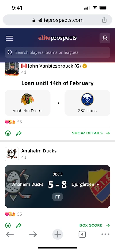
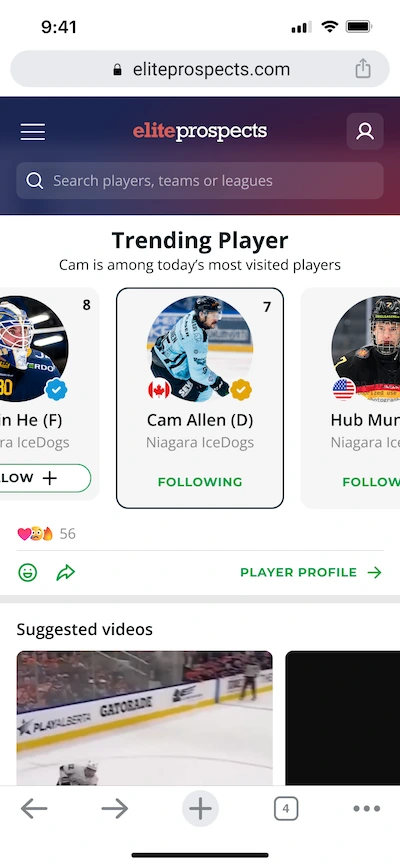
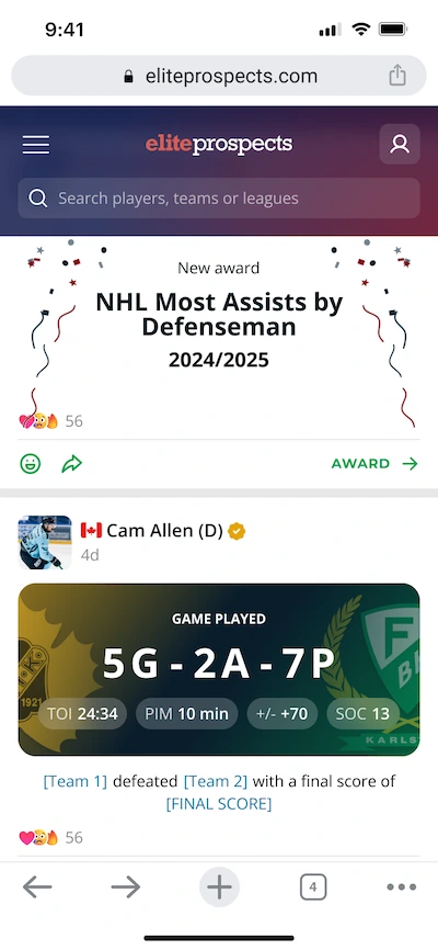
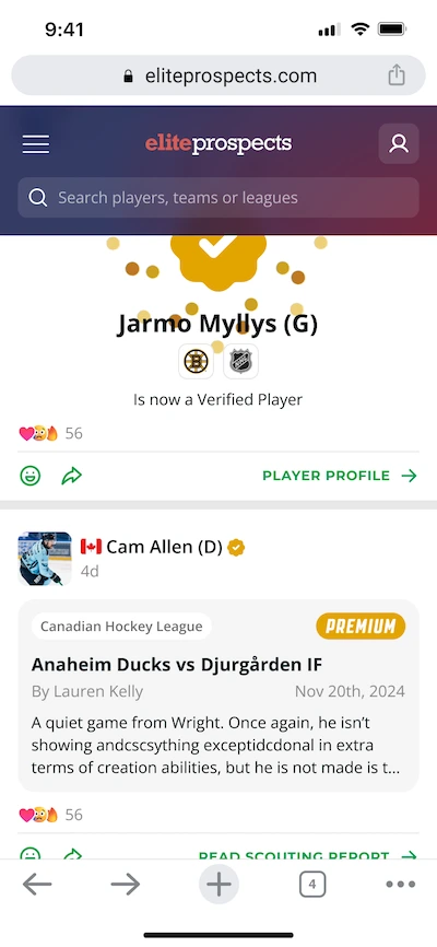
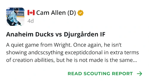
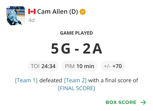
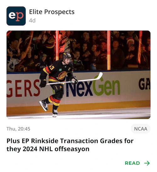
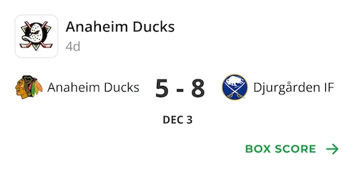
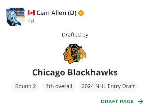
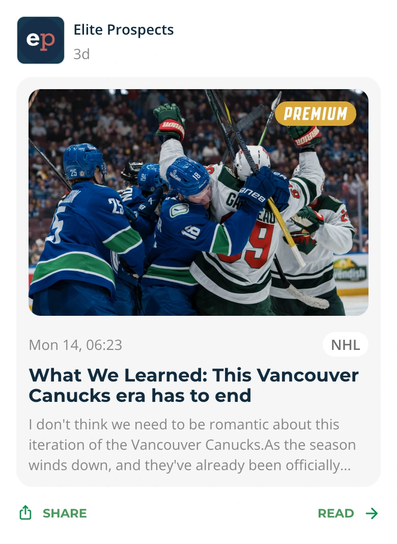
Here are a few of the designs I created:

Post Types 2.0

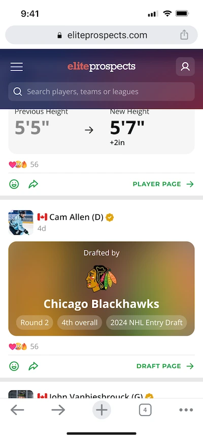
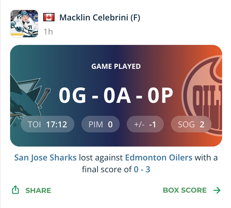
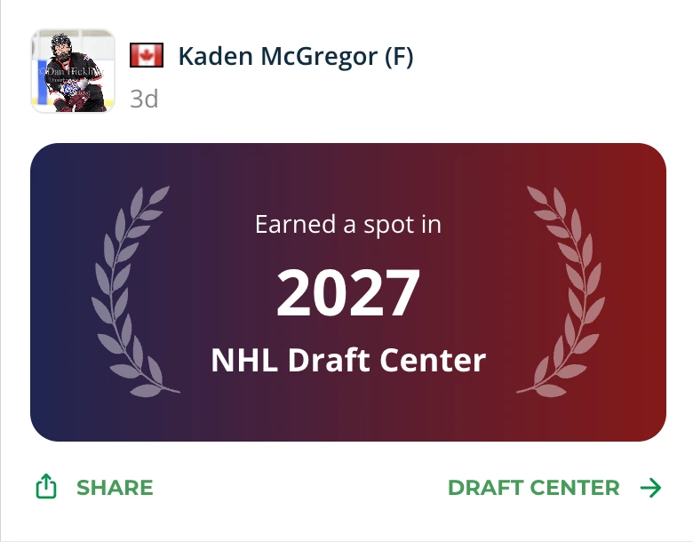
After launching the first version, we quickly noticed excessive white space and a lack of visual differentiation between post types. A few weeks later, we shipped a second iteration this time leveraging team-based gradients and color accents to give each post more character and instant recognizability.

Reactions

As the feed evolved, we shifted focus to interaction specifically, how users could engage with each post. We identified two key modes: comments and reactions. Reactions were our first step, since they offered a quicker, lighter way to engage.
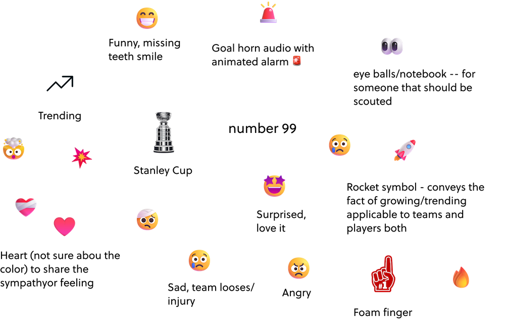
I began by gathering feedback on the types of reactions hockey players actually wanted, and narrowed it down to the most common, widely understood options. Here are a few that made it into the final set:
I wanted to limit the number of reactions to seven, striking a balance between variety and clarity. This number fits comfortably on mobile screens without feeling cramped or making the icons too small.
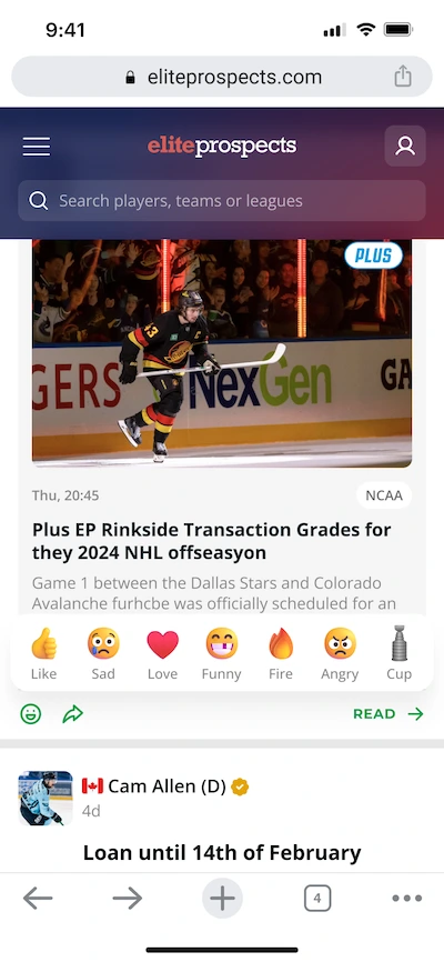
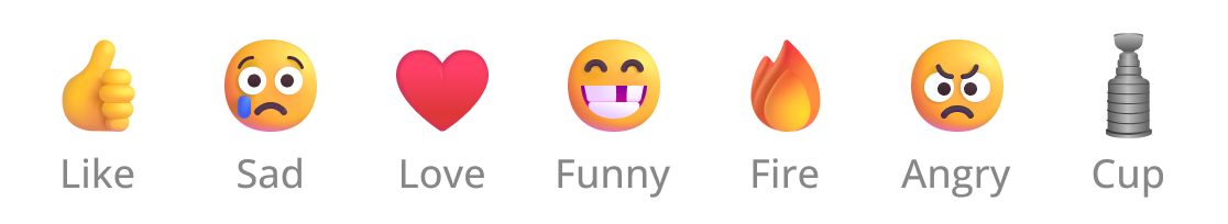
It also aligns with common patterns found in other social platforms, helping users recognize and adopt the feature more intuitively. After exploring several options, I landed on a set of seven core reactions that reflect how hockey players and fans respond to game moments and updates:
After some initial usability testing in Maze, I received feedback that users struggled to understand the difference between certain reactions — particularly the cup and the foam finger.
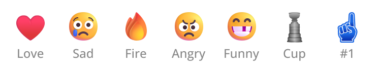
While I initially aimed for more hockey-specific icons, we made the decision to remove the foam finger to reduce ambiguity. I then refined the set based on feedback and visual clarity, landing on the final version of reactions used in the feed:

Animations

To make reactions feel more interactive and rewarding, I added a subtle animation when a user taps a reaction.

The animation begins with a burst effect: a circle appears using the reaction’s color, followed by 14 small particles that radiate outward. These particles also inherit the reaction’s color and fade out gradually with a slight variation in hue, giving the interaction a playful and polished finish.

UX Tests

I run a Maze test with a Figma prototype to test if users can find the reaction modal in a post and react with a certain reaction. Also if they can find where other users have reacted. 

Imagine you are browsing the feed and see James Hagens' post. Add a fire reaction to it.

Maze test with Figma prototype.

How easy was it to react to the post?

Here i chose to use 4 categories to not let users choose something in the middle..

Very easy • 64%

Somewhat easy • 30%

Difficult • 3%

I didn’t know how to react • 3%

Was there anything unclear or confusing when reacting to the post?

Free text 

Where you able to find where all reactions are shown?

Here i chose to use 3 categories for simplicity. 

Yes, easy • 100%

Yes, but it took some time • 0%

No, I couldn’t find it • 0%

Overall how do you feel about the reactions in the feed?

Here i choosed to keep a simple 5 star review. The results are great with majority giving 4-5 stars.

3

4

9

23

47

Do you have any suggestions to improve the reaction experience?

Some of the responses we got.

Seems like it works pretty smoothly!

Perfect 🔥

All good

I think they are all good!

These are great! The only other one I like to use is 💯 but love the cup, the #1 fan, and missing tooth!

Looks good

Missing 🐐🐐

Looks great

Final Designs

Some text

What I Learned

Some text

My work