My role
User Research
UX/UI Design
Tools
- Figma
- Clarity
- Jira
How insights from tinder's onboarding
boosted eliteprospects' player profile completion
I redesigned the player profile onboarding, inspired by Tinder, to make it more engaging and user-friendly. The changes led to a 1.6x increase in profile engagement, especially in areas like images and endorsements, resulting in more comprehensive and interactive profiles for the scouts.
Background
EliteProspects is one of the leading platforms worldwide for hockey statistics, profiles, and scouting, used by over 1 million users weekly. The platform serves a global community of players, fans, scouts, and agents, who rely on complete and detailed profiles for visibility and scouting opportunities.
However, the previous player profile setup was outdated and disengaging, with many sections left incomplete. Key profile areas, such as images, fitness data, and endorsements, were underutilized, limiting players’ ability to showcase their full potential to scouts.
Goal
The goal of this project was to redesign the player profile onboarding process to improve engagement and increase profile completion. By making the setup more interactive and user-friendly, the aim was to help players better showcase their skills and statistics, while ensuring scouts could easily find complete and well-rounded profiles for recruitment.
Challenge
One major challenge was the limited initial engagement, which made gathering user feedback difficult during the design process. Without a significant amount of data from real users, we had to rely on research from similar platforms and apply best practices to ensure our new approach would be effective.
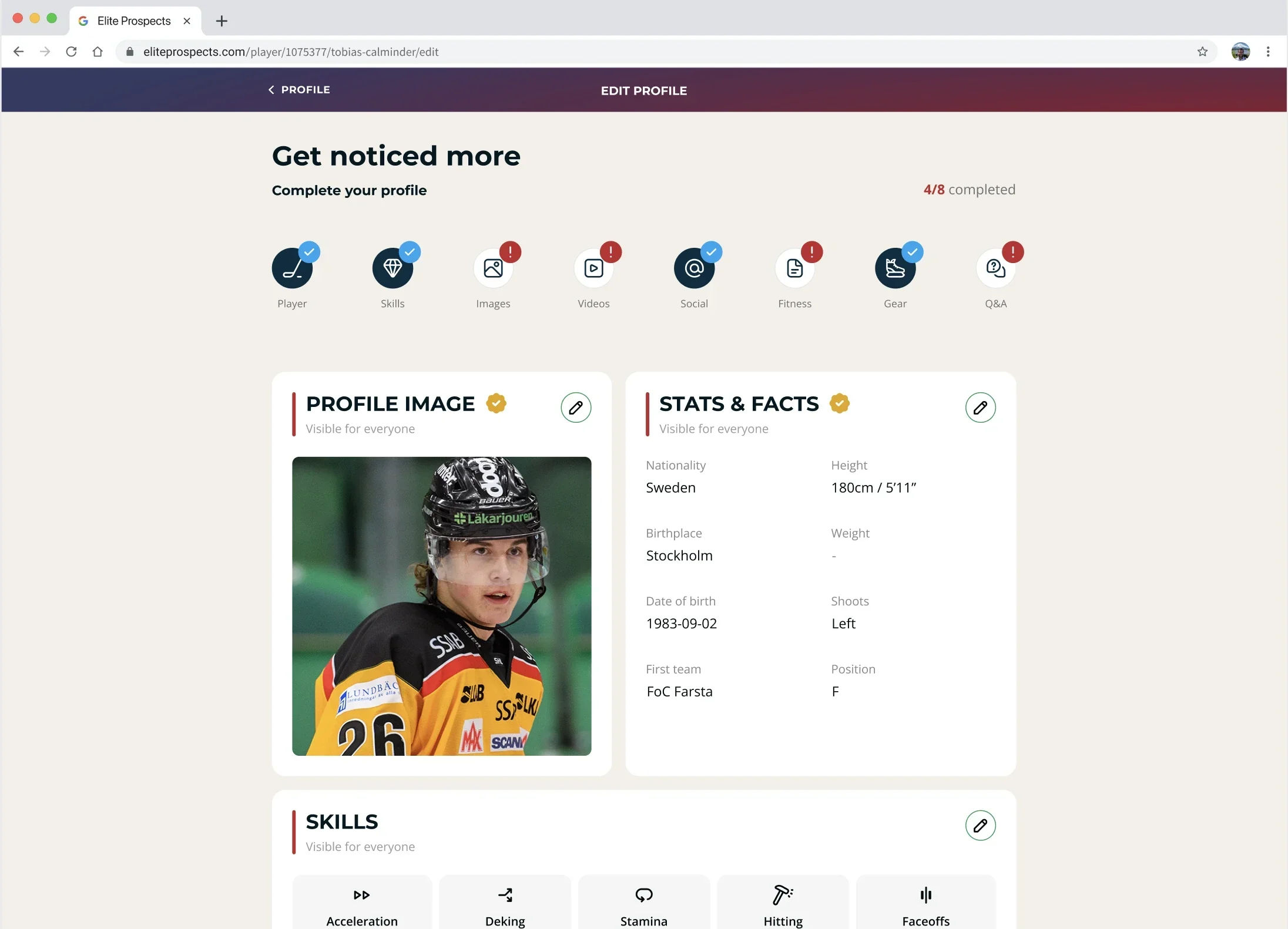
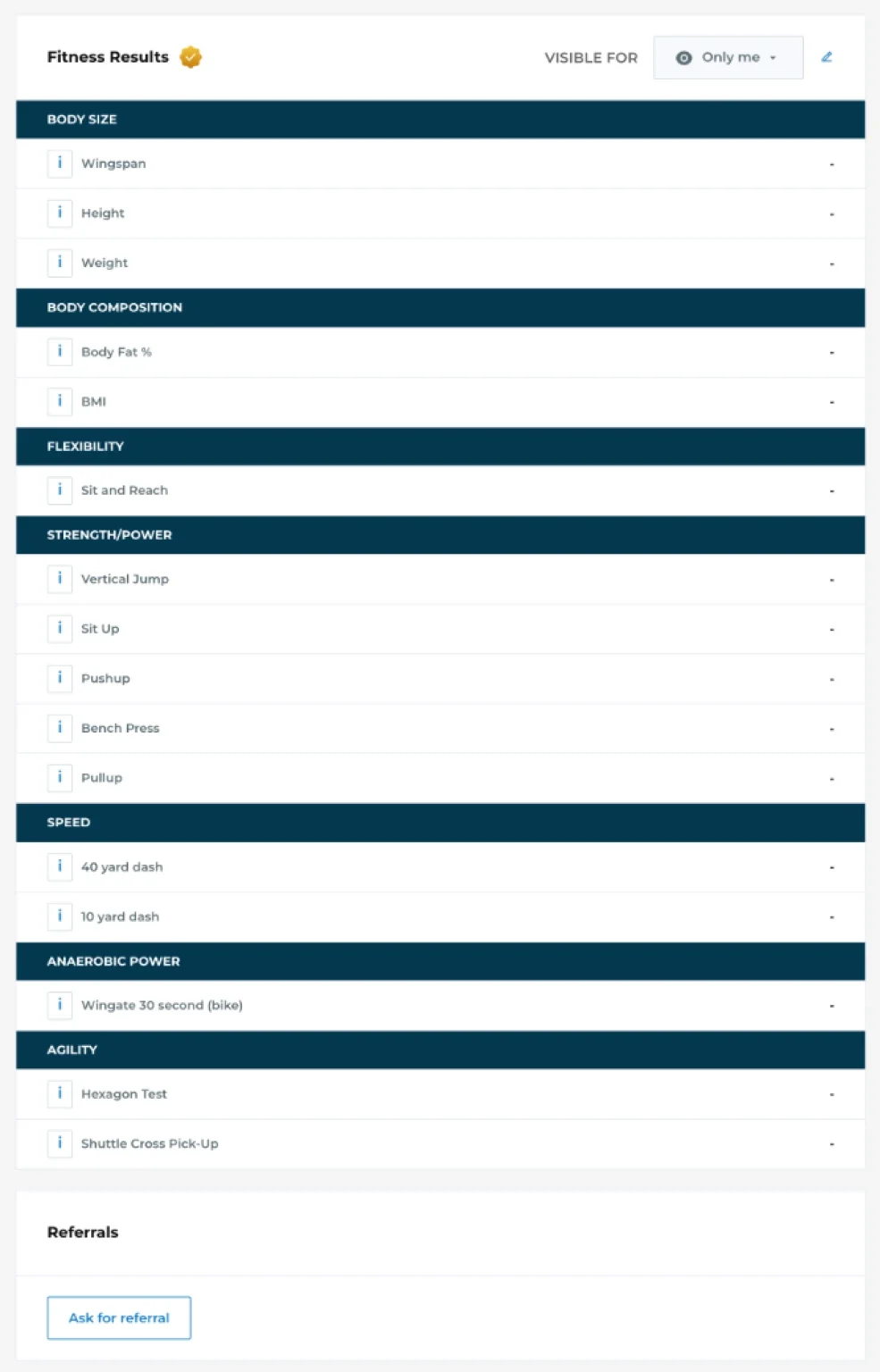
Old Edit Profile page
The previous profile setup violated Hick’s Law, presenting too many choices at once, which overwhelmed users and led to lower completion rates. This issue, combined with a lack of visual hierarchy, made it difficult for players to prioritize important sections.
Approach
To make the player profile setup more intuitive and engaging, I applied several key UX principles. Hick’s Law was used to break the process into simpler, manageable steps, reducing decision fatigue and improving completion rates. Fitts’s Law guided the placement of larger, easy-to-click buttons for key sections like endorsements and images, improving ease of interaction.
Drawing from Jakob’s Law, I used familiar design patterns, like those found in Tinder’s onboarding flow, to make the experience more intuitive and ensure that players felt comfortable navigating the new layout. Additionally, by enhancing the visual appeal in line with the Aesthetic-Usability Effect, I created an inviting interface that motivated users to complete their profiles.
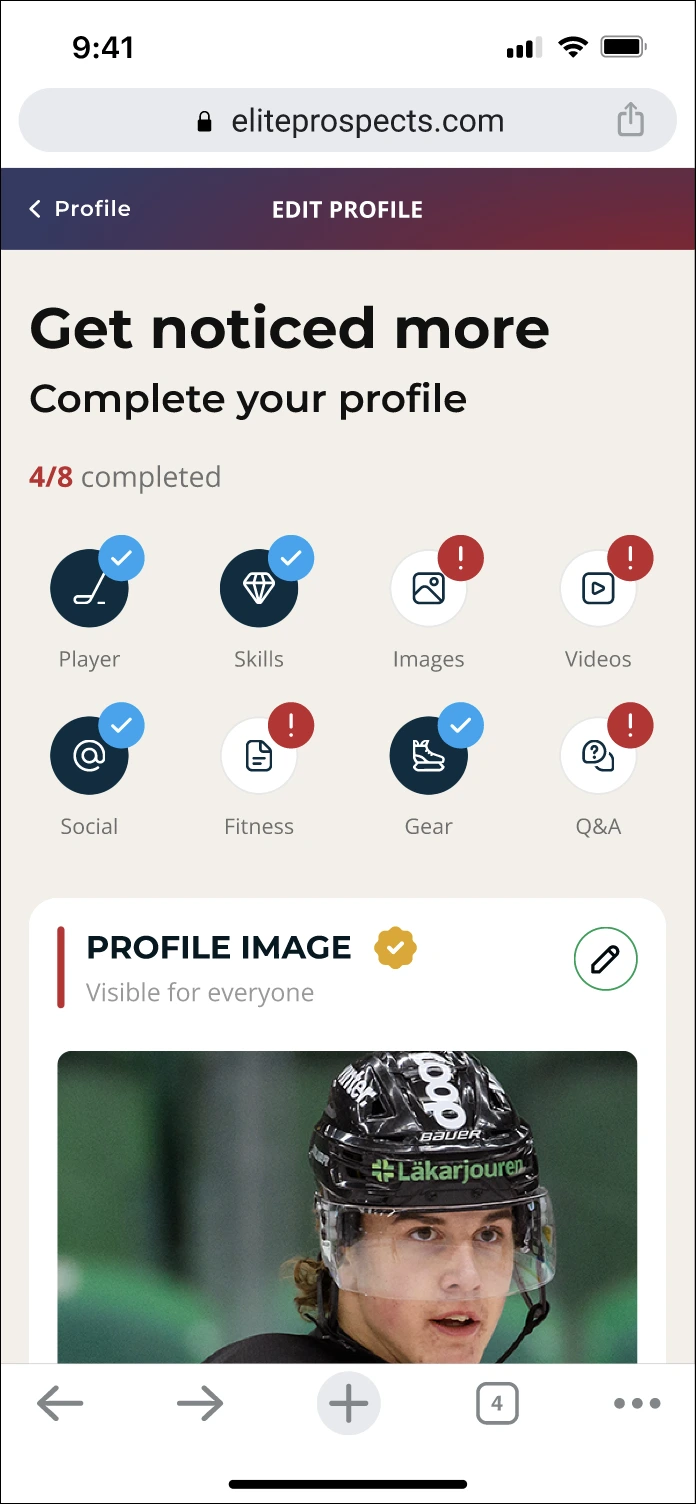
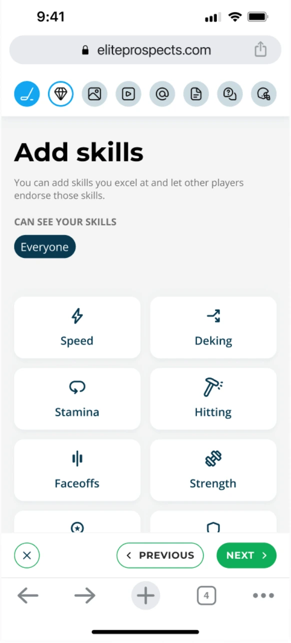
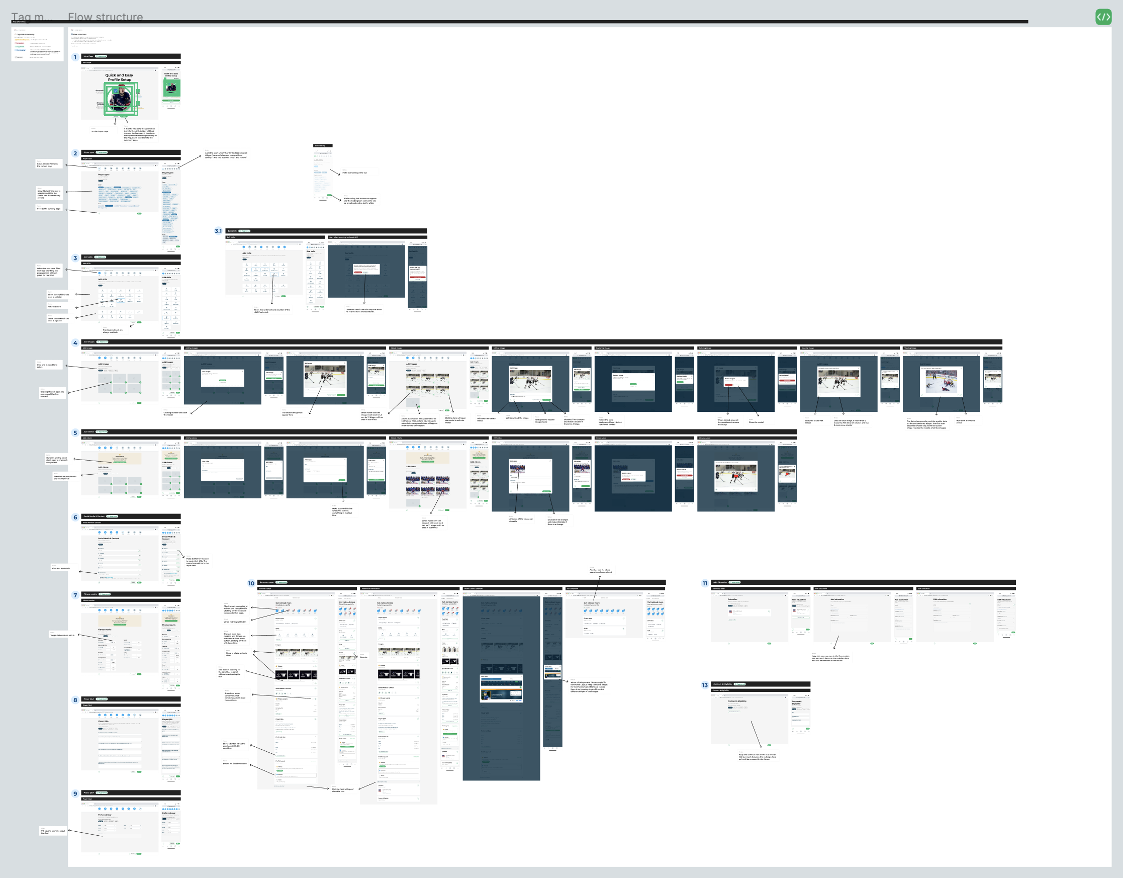
Transforming the profile setup into a step-by-step onboarding
I transformed the profile setup into a step-by-step onboarding by simplifying the process and making it more intuitive, drawing inspiration from Tinder’s familiar onboarding flow. Here are some steps from the onboarding.

More appealing player skill design with icons and endorsement counts.
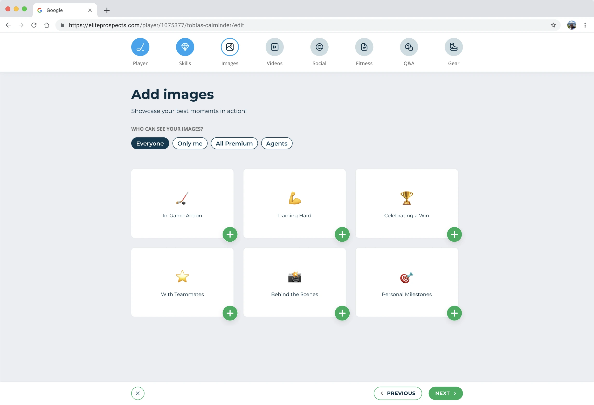
Six placeholders encourage image uploads, with more appearing as needed. Emojis and text guide selection for consistency and easier scout review.

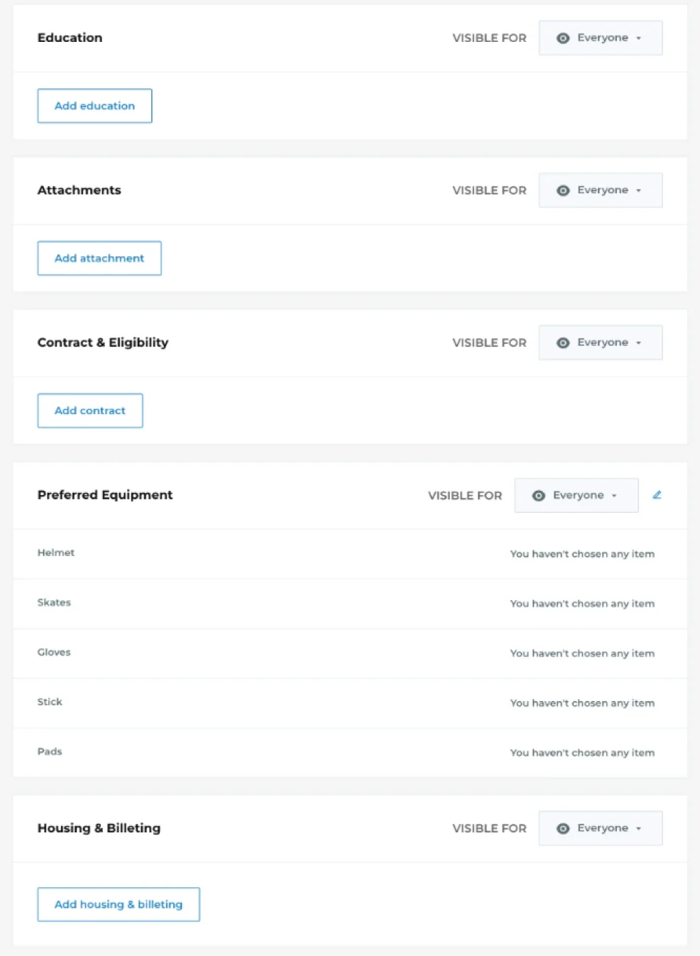
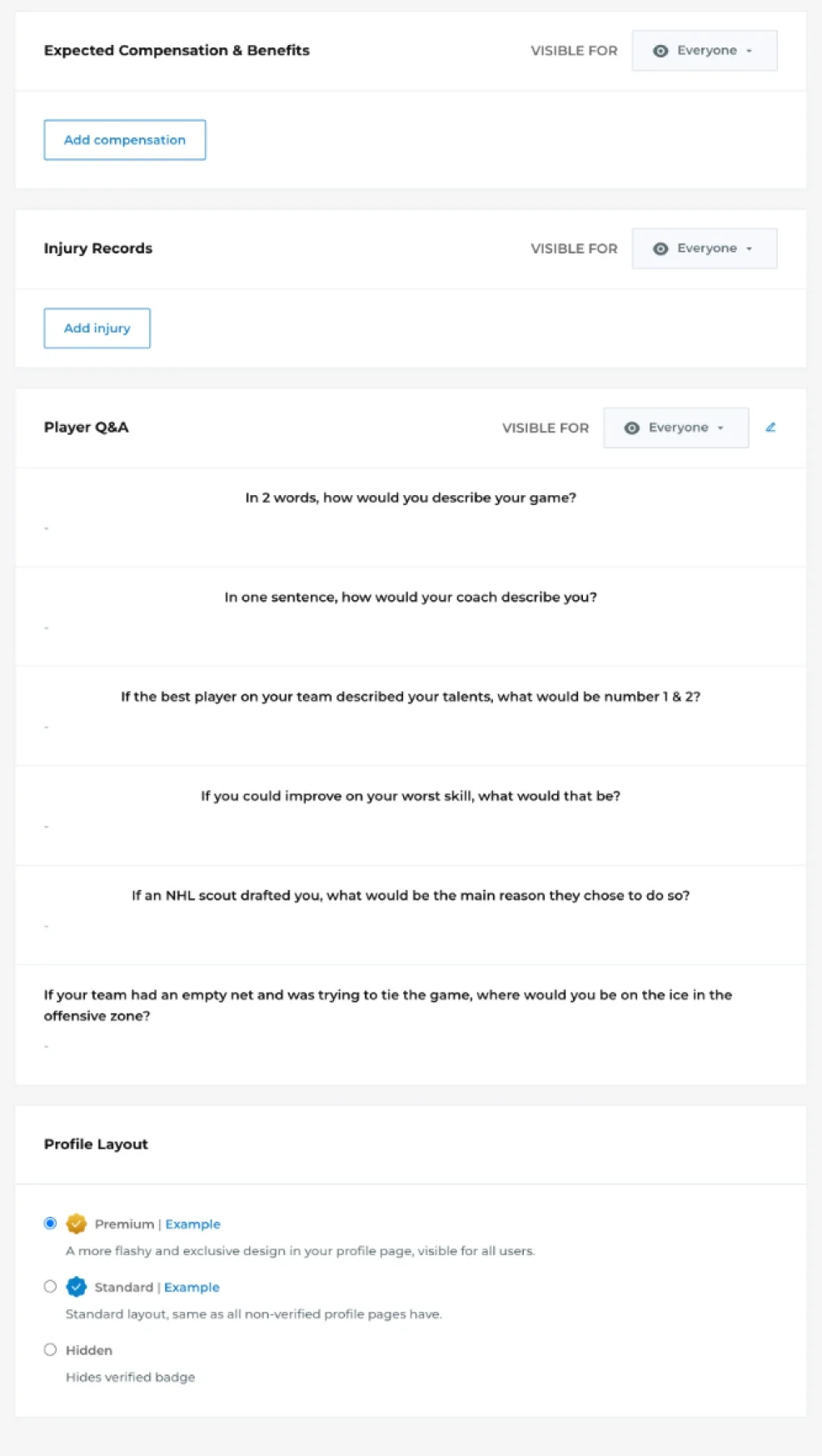
New summary page for better navigation
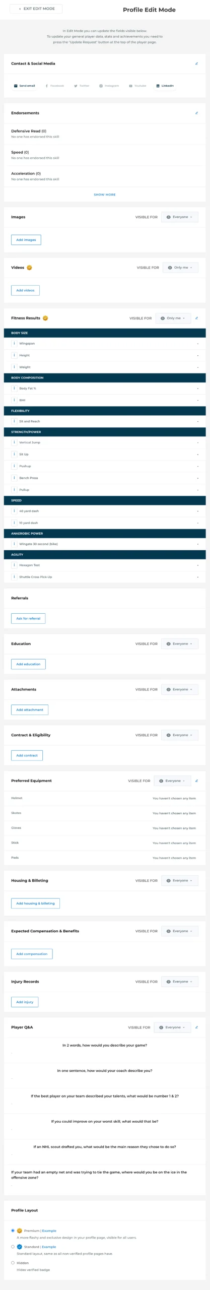
The old layout of the Edit Profile page was long, cluttered, and lacked visual hierarchy, making it difficult for users to navigate and update their information. Sections like skills, images, and fitness results were buried under an overwhelming number of fields, and there was little motivation for users to complete their profiles.
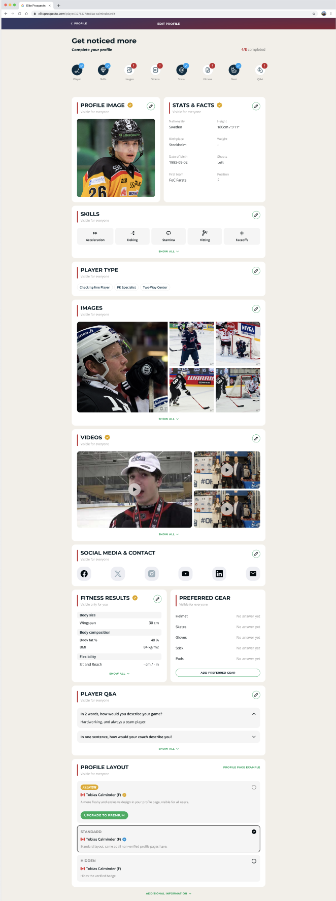
The redesigned Edit Profile page integrates improvements from the onboarding, creating a more structured and user-friendly experience. Each section, such as skills, images, and social media, is clearly defined with visual cues and icons, making it easier for players to navigate and update their profiles. The new layout introduces placeholders, progress indicators, and streamlined forms that encourage users to complete missing sections. This ensures a cohesive flow from onboarding to profile editing, motivating users to fully engage with their profiles and improving overall usability.
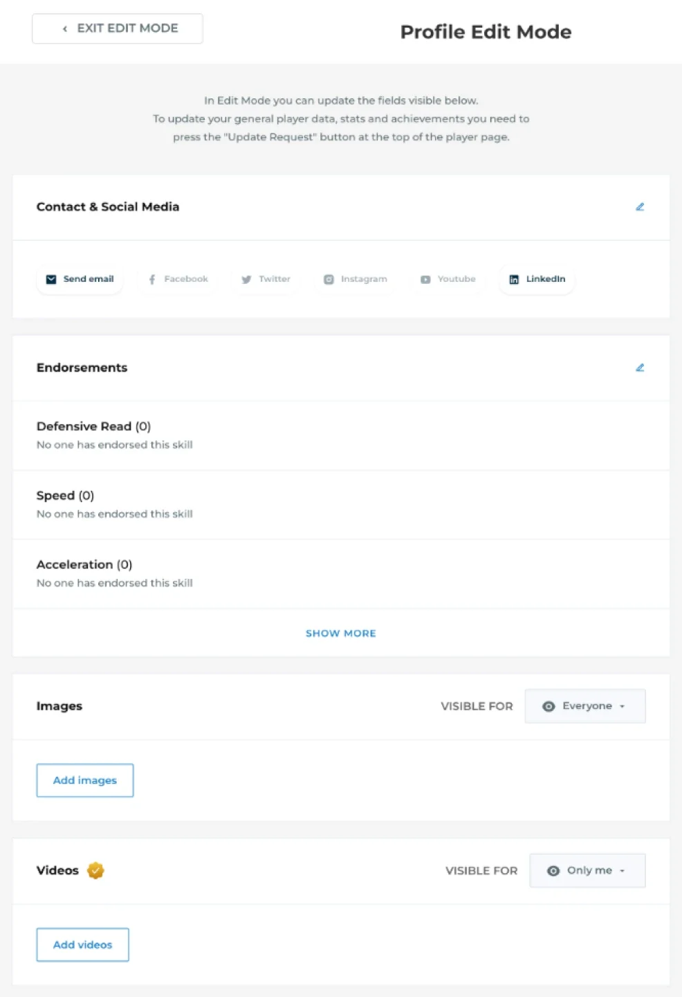
Handover to devs
To ensure a smooth and efficient development process, I prepared a detailed handover for the dev team. This included clear documentation, interactive prototypes, and comprehensive design specs. Each component and interaction was carefully annotated to minimize any confusion during development. I also provided assets such as style guides, icons, and component libraries to maintain consistency across the platform.
Key elements of the handover included:
Interactive Prototypes: Detailed Figma files with clickable prototypes to demonstrate user flows and interactions.
Design Specs: Measurements, spacing, and guidelines for each element to ensure pixel-perfect implementation.
Component Libraries: A set of reusable components for the devs to implement, aligned with the overall design system.
Annotations: Clear explanations for interactions, behaviors, and edge cases to avoid ambiguity during development.
With these resources, the dev team was able to implement the designs efficiently and maintain the intended user experience throughout the process.
Results
The redesign led to a 1.6x increase in profile engagement during the first week after launch, reaching the highest point ever recorded for profile completion. Key sections like images and fitness saw significant improvements, driven by applying Fitts’s Law for easier interactions and the Aesthetic-Usability Effect to create a more engaging and inviting design.
This not only improved the players’ visibility but also enhanced the platform’s overall usability, benefiting both players and scouts. The revamped onboarding process successfully transformed a previously underutilized feature into a key element of the EliteProspects experience.
Endorsements
582% increase
The redesign of the Endorsements (Skills) section made it more visually appealing, with clear icons and engagement cues. This resulted in a dramatic 582% increase in endorsements, as players were more likely to complete this section and showcase their skills.
Images
71% increase
The updated Images section, featuring placeholders and guided text with emojis, saw a 71% increase in uploads. Players were motivated to add more images, knowing it enhanced their profile’s visibility and attractiveness to scouts.
Videos
148% increase
The redesigned Videos section, which included clearer upload options and prompts, led to a 148% increase in video uploads. This made it easier for players to showcase their skills visually, further enhancing their profile.
Equipment
317% increase
The Equipment section also saw a notable 317% increase in engagement. The more prominent placement and simplified form design encouraged players to fill out their preferred gear, giving scouts more relevant information.
Conclusion
This out-of-the-box approach to redesigning the player profile and onboarding system led to remarkable improvements in user engagement. By implementing fundamental UX laws such as Hick’s Law to reduce cognitive load, Fitts’s Law to improve interaction, and Jakob’s Law, inspired by familiar patterns like Tinder’s onboarding flow, we were able to create a more intuitive and inviting process.
These principles, combined with the engaging onboarding inspired by Tinder, played a crucial role in guiding the redesign. The result was a more seamless experience that not only boosted profile completion but also enhanced player visibility. This case study highlights the power of applying both UX best practices and creative inspiration to deliver exceptional results.